29.4.11

12 - Gordon Matta Clark's "Conical Intersect"


In 1975, artist and "anarchitect" Gordon Matta Clark cut an intersection of a twisted conical shape into the side of couple derelict in Paris adjacent the the Centre Pompidou. Using crude equipment such as drills and saws, Matta Clark creates what contemporary architecture students might call a "Boolean subtraction" in an existing building primitive. Not a figurative primitive, but an actual abandoned building - a cultural artifact that was long lived and was then dead. By cutting this intersection, Matta Clark reveals the buildings in their material construction. Like a crudely dissected frog for high school biology class, surface is torn away and guts remain for all to see.

Most projects in this collection need to make efforts in order to hide their underlying material complexity. This project is entirely about communicating material nature, even to the extent that the specimen is destroyed. Animal dissection is a good analogy in this way. The value of this project is not in creating new form by manipulating a primitive, but rather by gaining special insight into existing conditions of architecture and space by dissecting that primitive.

11 - OMA's McCormick Tribune Campus Center


Rem Koolhaas and the folks at OMA designed this student center for IIT in Chicago a few years ago. As is the case in many OMA projects, a variety of external forces, real or imaginary, informs one striking formal gesture. In this case, a broad single story building was conceived to occupy maximum campus area, as a way to achieve long term urbanistic goals established in the 1940s by Mies van der Rohe. The existing elevated train, which had been an overwhelming source of noise in the past, is housed in a shiny metal tube to help mitigate the sound. The result of these two forces is downward pressure on the building form.

Like in the Mestia Airport project, the primitive form seems to be drawn from a preconceived idea of the single-story, metal and glass clad modernist structure. The material rules that have been established in the primitive are challenged by this downward force from the train-tube. The end result is the outward appearance of a modernist building being crushed. While this may seem like an unappealing condition at first, OMA is able craft a rich and organic interior with a lot of welcomed sectional drama.

Source: OMA website

10 - Oak Chair by Charles Rohlfs


This is one of the more well known pieces created by American Arts and Crafts furniture maker Charles Rohlfs. This chair, as with many creations from the Arts and Crafts movement, exhibits a largely intuitive reinterpretation of common primitive furnitures. While the Avanzatti brothers used their craft to contradict materiality - to mask an underlying complexity, Rohlfs work celebrates materiality. Each piece is an exhibition of the maker's craftsmanship. One clearly discerns the evolution of raw wood being rigorously cut, carved and refined into fine detail. The carved fluid details are enchanting partly because of one's understanding of the oak material.

The primitive form of the wooden chair is manipulated toward a delicate elegance. The back rest's function is primarily to lift up and exhibit the hand carved design work, rather than to lean one's back against it.

Image source: Wikipedia

09 - Surreal Furniture by Avanzatti of Buenos Aires


Designers Eduardo and Marcelo Avanzatti have created a collection of surrealist oak furniture. Each piece, while retaining a glossy stained oak finish, seems to bend with in space. They are said to refer to the work of Dali, whose paintings famously involve common objects which appear to be "melting in the sun". While I have thus far made an effort to avoid including projects in this collection which feature deformed primitives solely for surrealism's sake; that is, to suspend reality and free the mind for speculative purposes, these pieces are still potentially functional designed objects. Presumably, enough care has been put into the design of these pieces to ensure that they still open and close, and can contain things.

These pieces are clear. They are not attempting to deceive. They do contradict one's expectations of oak as a material, but through meticulous wood craft, the oak bends to the designers' will. These pieces, when in use, likely sit a space which is not surreal. They are irregular objects in an otherwise regular domestic setting.

Source: Decoration-Decoration Blog

08 - Frank Gehry and Vlado Milunić's "Dancing House"


Prague's Nationale-Nederlanden building, commonly dubbed the "Dancing House", uses deformation to illustrate a narrative. The primitive form of the European concrete mid-rise is first cartoonized. Picture windows are detached from the mass and clumsily pasted back on and lines of horizontality are warped and shifted fluidly. This effectively suspends materiality, thus allowing a variety of cartoon physics to appear to take place. Sitting on a corner lot, the wider, more regular ("front") facade gives way to the (side) facade which is formed into two turrets. These turrets become characters which, as the narrative goes, are dancing. The narrative goes as far as assigning genders, a masculine (named Fred) and a feminine (named Ginger). Fred wears the rest of the building's cartoon-concrete material, while Ginger wears a sensual sheathing of glass. Following a decontructivist logic, the material surfaces are detailed as to retain an identity distinct from the building mass as a whole. The turrets also take on masculine and feminine form, with Fred strong and broad shouldered, and Ginger as a gracefully slender hour-glass.

Again, we've returned to anthropomorphism. The primitive, which has no distinctly human features, is creatively remolded so as to create such features. This potentially opens a new venue for exploration: assigning gender characteristics to conventionally inanimate forms. Perhaps this sort gender assignment is more common is some cultures than in my own. Latin and contemporary Romance languages use words which have gender forms after all. As another example, the classical orders are said to have gender; the Doric order being the most masculine, and the Corinthian order being the most feminine. Are these things relevant in an age where gender differences are being downplayed in the interest of equal opportunity? Is the discreet narrative the only appropriate use?

Image Source: HQWorld

28.4.11

07 - Buro by DesignWright for Lexon


This a new office stationary set designed by London-based studio DesignWright. Seven pieces of typical office desktop equipment are reinterpreted into a unified stack-able set. Individual pieces are differentiated by subtle hues and by name, which is impressed onto the exposed edge in a clear, sober, caps-locked typeface.

This is an interesting project amongst this collection primarily because it expresses an opposite process. In many {posts} and in the name of this {blog}, I use words like distort or dismorph or deform.. Primitive forms are always simple (pure?) ideas which are articulated and made more complex (corrupt?) after the fact. In this case, a number of objects which have been developed over a long period of time, more or less independently, are being simplified; morphed into a 'purer' form. In a sense, this is what all minimalist design is about, but rarely do designers attempt it on such a variety of refined "primitive forms".

Source: Dezeen

06 - Social Housing Tower by Roldán + Berengué


Spanish firm Roldán + Berengué has recently built a public housing tower in Barcelona. While the building rises 16 storys above the ground, the form appears to divide into 5 levels. Superficial facades composed of 3 different metal materials emphasize the reading the of "levels" over the actual floors. The motivation behind this move seem to be to scale the building down. The 5-story primitive form inflates to contain 15 floors of subsidized flats (plus the first story, which that entire mass hovers over). The tower stands alone beside a wide public square, leaving the building to deal with its massive size any way that it can.

The idea seems relatively straight forward. The success of the effect can only truly be appraised when seen in person. As we've learned from lower Manhattan, one's ability to interpret facade components of tall buildings depends on where you're standing, or are able to stand. With this in mind, perhaps this treatment is appropriate in such a wide open setting. We found that facade elements which scale can seem bizarre if one was to crane their neck backward and look up to see them.

Are Roldán + Berengué's 5 levels mistakable for floors? Maybe this effect does work near to the building. The strong horizontal lines would compress if viewed from a sharp upward angle and the actual windows might de-emphasize further. How would lower Manhattan look if its skyscrapers were designed this way?

Source: ArchDaily

05 - Gibson EDS-1275


The Gibson guitar company is known for a number of iconic guitar models. Their "SG" body style is just one of their many contributions to the imagery of the rock and roll. In 1963, as a custom order model Gibson began offering the EDS-1275, an SG-style body with two necks. The lower neck was that of a standard 6-string guitar while the upper neck was a 12-string. Theoretically, the guitarist could alternate between the two necks, i.e. between two sounds, two ways of playing, while performing the same piece of music. While rock and roll rarely seems to involve the level of song craft that would require a guitarist to be so resourceful, a few famous guitar players, most notably Jimmy Page of Led Zepplin, would turn the EDS-1275 into a minor icon itself.

As in previous examples, there is an obvious invitation to anthropomorphize the guitar. The basic components of a guitar have names like body, neck, and headstock. Continuing this analogy, the EDS-1275 is a sort of two-headed beast (not a two-headed person, though I'm not sure why). At any rate, having two heads is not scary, its clever. One head is better at one task. The other head is better at another task. Of course, it is not necessarily a better guitar for most situations. Just has with Cerberus, or mighty Hydra, additional heads require a larger bodies. The EDS-1275 does appear rather unwieldy, albeit less so in the hands of a true rock professional.

Image Source: Klipsch

19.4.11

04 - Neo-classical Skyscrapers of Lower Manhattan


Returning to architecture, let us briefly consider the Manhattan Financial District. From the dark, canyon-esque streetscapes rise building facades of unrelenting verticallity. Particularly curious are some of the classically detailed skyscrapers built prior to the dominance of mid-century modernism. Facade elements; columns, arches, entablatures, closely reference the classical orders.

The examples I have presented so far have shared a discernible intent to elicit wonder, to purposefully challenge the perception of the viewer/reader. The neo-classical skyscrapers of Lower Manhattan seem more like an idealized geometry, the Greek temple being the "primitive form" in this case, which has been recklessly extrapolated and extended into the sky.

The classical orders were used to provide human scale in architecture. Looking back to the human body as an idealized geometry, the orders use the language of head, body, foot, i.e. capital, column, base. In the classical skyscraper, the anatomical components of the facade are stretched, multiplied, scattered, sent up high above the street environment.

Image source: New York Apartment Blog

03 - Reed Richards/Mister Fantastic


Let us take a moment to step outside the world of design and consider these ideas within popular media. Reed Richards, aka Mister Fantastic, is a character developed in 1961 by comic book legends Stan Lee and Jack Kirby. The leader of the Fantastic Four, Richards gained the power to stretch and deform is own body at will after being exposed to some space radiation.

His "primitive form" is that of a man; not just a man, but an idealized man, physically and mentally. Artists, architects, and philosophers have long regarded the human form as a sort of sacred perfection: Vitruvian Man, etc. Richards' is superhuman. He is able to ignore the material nature of flesh and expand his physical self. His body is elastic. As he releases his "grip", his body returns to its human ideal. This affords him opportunities; to reach and to move through spaces where normal humans cannot, but to return to his human form and pass among his fellow people, insothat he may continue to lead and influence (his teammate Ben Grimm - the "Thing", does not have this luxury).

Deformed, Richards' has a comical appearance. Could this be partly due to his nature as a cartoon? If, say, his extended limb were to be seen in a level of material detail comparable to that of reality, would it look silly, or horrifying?

Image Source: The Comics Cube!

12.4.11

02 - Warped Chairs by Sebastian Brajkovic


Furniture designer Sebastian Brajkovic has a series of pieces that involve recognizable furniture elements and embroidered patterns which warp in ways that seem to conflict with their own primitive logics. Similar to the Mestia Airport building, Brajkovic's work is a somewhat literal construct of familiar elements, referential to an old style, but deformed in a way that seems to defy its own material logic. To re-apply my own terminology, this traditional wooden chair with embroidered cushion is the "primitive form", which the designer has then subjected to these distortions.

Whats of particular interest in Brajkovic's chairs is how their actual function is altered by the deformation. In the case of "40 2009 Lathe IX" (pictured above), the primitive form is a chair in which you must sit upright with you feet on the floor. Through the designer's process, in this case adding another chair, bending the backrest back 90 degrees and melding that backrest into the that of the first chair, he changes the function into that of a lounge chair. One of the backrests becomes a footrest instead.

His patterned embroidery demonstrates this curious transformation as well. The diamond pattern in the example is appropriate for one's back, but not ones feet. Again, like in the Mestia Airport building, there's an effort to obscure transition; in effect, to obscure material truth.

Source: Sebastian Brajkovic website

01 - J. Mayer H.'s Mestia Airport Building


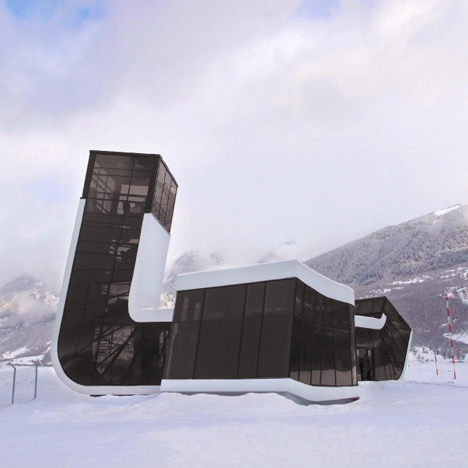
The architect known as J. Mayer H. has recently completed a building for an airport in Mestia, Georgia. The project features what appears to be a simple long, rectilinear form which has been has been bent at multiple points. Mayer has executed the design such that one can easily separate the "primitive" form and materiality from the 'bent' gestures, i.e. the distortions of that primitive form. To elaborate, the building appears to be based on classic modernist conception of an idealized space: the establishment of the floor plane and the ceiling plane with the other necessities of structure and envelope being visually minimal. Steel piloti and aluminum curtain glazing, stemming from that old ideal, have become commonly recognizable through repetition over the latter 20th century as common and, perhaps, vernacular (though not necessarily inelegant).

The primitive form, by which I mean the materially pragmatic result of the theoretical ideal that has developed over half a century of vulgar use, is thus contradicted. Through the designer's warping and bending of, say, the curtain wall system, the basic efficiency by which the system is legitimized is eliminated by the need for costly custom fabrication. Is there an obscure logic or philosophical agenda at play, or is this some sort of cheap trick?

The mass, which in its primitive form is a statement of clarity, is strikingly difficult to understand. Seeing it at first, one almost perceives a linear form. There are, in fact, three ends. This effect is partly achieved by the elimination of corners. The three prongs of the building are joined at a center in such a way that one prong blends into the adjacent one seamlessly without any inside-corner condition. Through clever detailing, the box-like primitive sudden has three ends (one of which rises into the air).

Source: Dezeen